optuna.visualization.matplotlib.plot_slice
-
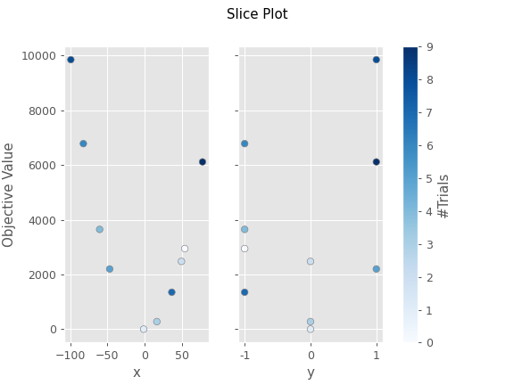
optuna.visualization.matplotlib.plot_slice(study: optuna.study.Study, params: Optional[List[str]] = None, *, target: Optional[Callable[[optuna.trial._frozen.FrozenTrial], float]] = None, target_name: str = 'Objective Value') → matplotlib.axes._axes.Axes[source]¶ Plot the parameter relationship as slice plot in a study with Matplotlib.
See also
Please refer to
optuna.visualization.plot_slice()for an example.Example
The following code snippet shows how to plot the parameter relationship as slice plot.
import optuna


def objective(trial):
    x = trial.suggest_uniform("x", -100, 100)
    y = trial.suggest_categorical("y", [-1, 0, 1])
    return x ** 2 + y


sampler = optuna.samplers.TPESampler(seed=10)
study = optuna.create_study(sampler=sampler)
study.optimize(objective, n_trials=10)

optuna.visualization.matplotlib.plot_slice(study, params=["x", "y"])
- Parameters
study – A
Studyobject whose trials are plotted for their target values.params – Parameter list to visualize. The default is all parameters.
target – A function to specify the value to display. If it is
None, the objective values are plotted.target_name – Target’s name to display on the axis label.
- Returns
A
matplotlib.axes.Axesobject.
Note
Added in v2.2.0 as an experimental feature. The interface may change in newer versions without prior notice. See https://github.com/optuna/optuna/releases/tag/v2.2.0.